


 $14
delivery on most products**
$14
delivery on most products**
 24hr production*
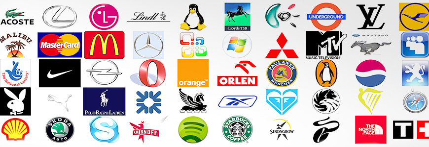
Designing a company logo is not a simple process. Apart from the colors, font, size and content, your design must include something that appeals to the public on a subconscious level. A logo should ultimately be able to convey a message about your business to the public without actually stating what the message is. To the general public, a logo represents a brand that they instantly recognise and can associate with. For instance, the logo ‘Harley Davidson’ doesn’t actually state that the company manufactures motorbikes, yet that is what the public instantly associate the logo with because of the strength of the branding.
To a company, a logo means a whole lot more: it represents not only the company’s ideology but can also be a symbol of the strength of a company’s branding. To a graphic designer, the challenge lies in producing a logo that expresses this.
Statistics show that the logo design of 94% of the world’s most famous brands do not indicate what product they are actually selling. What that tells us is that a company does not have to rely on the product they are selling, but have used their name to create a reliable brand, and a brand that is consistent with its products gains a good reputation. Logos fall into three different categories: iconic, illustrative and typographic. Iconic logo’s feature both wording and a picture, while typographic designs use only words and are favoured by more traditional or conservative companies. Illustrative logo’s are created by using only a picture or graphics, so need to be extremely clear and are also one of the hardest types of logos to get right. There are a few general rules to remember when designing a logo for any company.
- Make sure the lettering and typeface are clear and easy distinguished.
- Keep the design simple but memorable. Unique designs can be effective if they aren’t too complex.
- A logo must suit the company. It should be able to grow with the company, so that in 50 years’ time the logo is still appropriate.
- It must be able to be applied to a wide range of mediums.
- Keep the logo color limited. Logos with too much color only make the designs too busy, which leads to confusion.
- Never use clip-art or base logo’s on existing designs. Apart from this being illegal, it conveys poor work ethics.
- Ensure the finished product is balanced. This means that it has a good combination of graphics or wording with good contrasting colors.
It is important that you do a bit of research before starting the design. Look at competitors from the same field and work out what makes their logo so effective. By comparing the different logos, you can be sure to design a logo that is unique to the field – which is a sure way to stand out from the crowd. If possible, find a symbol that represents the company on another level. The Nike ‘swoosh’ symbol is a perfect example – apart from being a simple and memorable design, it also has mythological ties as it was created to reflect the wing of Victory, the Greek Goddess.
Never incorporate a by-line within the logo, and try to avoid using big words. Interestingly enough, over 52% of the world’s most recognisable logos use 6 letters or less in their design, while a further 62% of these restrict the design to one word only. Another interesting fact is that 52% of top recognised brands use a solid background, while 40% use blue as the dominant color. But the most important thing to remember is to make sure the logo suits the company it is designed for.
Is it time to print your logo on some signage? If so, check out Easy Signs huge range of signage products and start working on how you can market your business using your new logo!